Tag Archives: work

Concerto in Yellow Minor

The Honey Sonata
Concerto in Yellow Minor

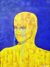
This is the last of the May 17-18 works.   This one is 16″ x 20″.   This was another experiment with colors and techniques that intrigued me at the moment.   Originally, I chose the title “The Honey Sonata”, because the background color resembles honey and sonata because, like with some of my previous paintings, I see a rhythm or “musicality” in some of my works.  However, after some contemplation, I changed it to the present title. The primary reason for the change was simply because “The Honey Sonata” just didn’t sit well with me subjectively.  The other reason is because a sonata is primarily for a keyboard instrument and there is no obvious connection to a keyboard instrument in this work. Concerto in Yellow Minor seemed to be a better fit, because a concerto is usually for one instrument (the dominant color equivalent here is yellow), but it can generally be any instrument.  I chose “…Yellow Minor” simply because it is a lighter, weaker shade of yellow.   A stronger, darker yellow I would call “yellow major”

Distance

Distance by Phil Slattery
Distance
by Phil Slattery


This came from a photo of a mannequin in San Diego I took about 1995 with a 35mm camera.  At the time I wanted to catch a mood of distance between people, not necessarily lovers, but between people who had some connection be it relatives, lovers, friends whatever. Some years later after I bought Photoshop Elements 2.0, it was one of the first photos I toyed with when exploring Photoshop.  I wanted still to capture that feeling of distance and toyed with several features until I produced this. The various subtleties of gray and white and the odd browns and greens add to the feeling along with the mottled look (like a very grainy photo) and, of course, the vacant, hollow eyes and the neutral feeling from the lips combine to make this a quite poignant work.

Wave and Sun

Wave and Sun
Wave and Sun

This has always been one of my favorites, though I am not certain why.  I painted this several years back (2009? 2010?) when I lived on the Gulf Coast at Corpus Christi, TX.  I do not recall how I came up with the idea.  Somehow it comes to mind that I was at Bob Hall Pier on North Padre Island when it occurred to me to have a wave with its crest pointing to the sun.  The sea and sky of course would be blue and the sun as a large yellow dot would draw the viewer’s attention to it along with the crest of the wave.   The sun would have to be off-center of course.  I made the texture of the wave by stringing light blue paint up and down in curves to shape the wave.  Now that I am thinking of it, it seems that a lot of the challenge in composition to me has been to draw the viewer’s eye around the canvas.  In my abstracts I try to do this by putting small spots of dabs of color against contrasting backgrounds.  For example, if I had a mostly dark blue abstract, I might put a dab of bright yellow paint in one corner and a bit of bright orange in another, and so forth, if I thought the viewer’s eye needed to go to that spot to keep the eye moving.   Anyway, that should be the subject for another post dealing with abstracts instead of something more realistic like this wave and sun.

Thoughts?  Comments?

Tears

Tears
Tears

I can’t recall when I painted “Tears”.   I chose a large canvas about 30″ x 36″ or something similar.  I probably laid down a coat of black Gesso first (I like a black undercoat), though I may have left the canvas white.  I wanted to bring out the color like Van Gogh did, so I used medium to high tones of contrasting colors.  I used a blue background to bring out depth, because blue is usually associated with distance.  I believe I kept that texture smooth (I don’t know where the painting is now, maybe still in Corpus Christi), so that no details would be outstanding and would bring out the depth more0.  I used a yellow to contrast with the blue and because yellow is normally associated with being closer.  I textured the figure with a palette knife to contrast with the smoothness of the blue and to bring the figure closer by adding detail.   Overall, I wanted to keep details to a minimum in order to accent the man idea of a man crying copiously.   I made the tears by stringing light blue house paint from a distance of a few inches (the closer one strings paint, the more control one has over it).  I wished later that I had made the tears the same color as the background, because the ones over his chest disappear into the yellow, being of a similar tone.  I am not good at drawing or sketching yet, so that’s another reason I tried to keep the details to a minimum.   All in all though, I wanted to make an emotional connection to the viewer by simply showing a man shedding copious tears.

Thoughts?  Comments?

Ragged Sun, Ragged Sky

Ragged Sun, Ragged Sky

I sometimes like to experiment with very basic forms or very basic ideas.  In this case I chose the sun.  The painting is 24 inches by 36 inches.  I used a large salad bowl to make the circle for the sun. I wanted to contrast the yellow of the sun with the blue of the sky.  I applied different tones of blue from the paint tubes along with a few dabs of other colors placed strategically around the canvas to draw the viewer’s eye to different areas. Then I smeared them around with putty knives and palette knives. I laid the yellow of the sun on thick and shaped it with palette knives to give the sun a rough texture and to make it seem like it is whirling.