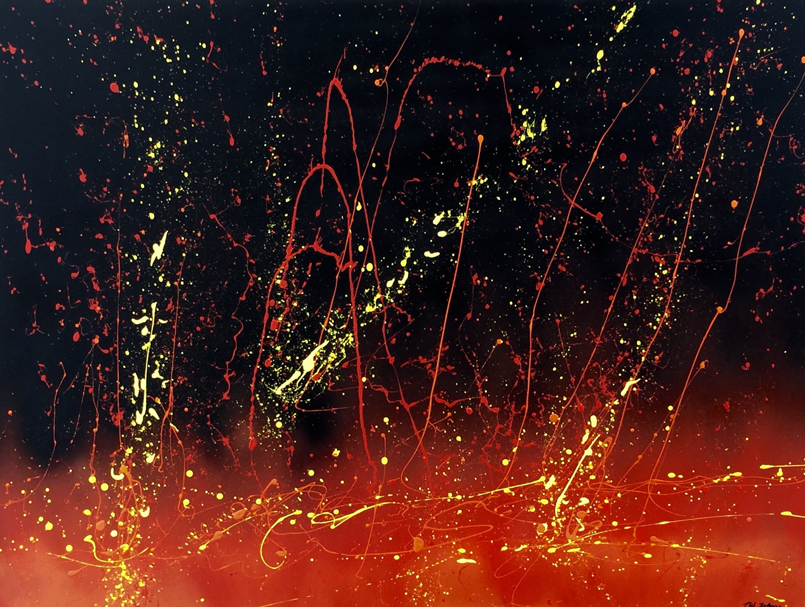
36″ x 48″. Latex and spray paint. Created June 5, 20215.
“De Profundis” is Latin for “out of the depths”. It is the opening of the Latin translation of Psalm 130: “Out of the depths I cry unto you…” I am writing a horror novel with hell as major theme. I wanted a painting that somehow caught a bit of the spirit of the novel. I started out by toying with some leftover spray paint and house paint and this is the end result.
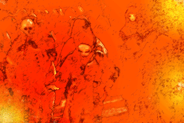
Another work created by using a photograph of a Danse Macabre from a Renaissance Faire and Photoshop Elements 2.0. I tinkered with the photo until what you see here emerged. I named it for the first impression that popped into my mind.
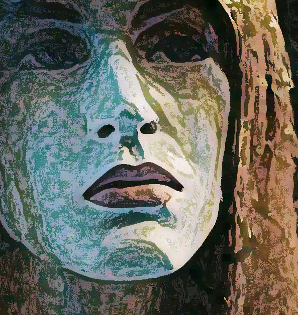
This came from a photo of a mannequin in San Diego I took about 1995 with a 35mm camera. At the time I wanted to catch a mood of distance between people, not necessarily lovers, but between people who had some connection be it relatives, lovers, friends whatever. Some years later after I bought Photoshop Elements 2.0, it was one of the first photos I toyed with when exploring Photoshop. I wanted still to capture that feeling of distance and toyed with several features until I produced this. The various subtleties of gray and white and the odd browns and greens add to the feeling along with the mottled look (like a very grainy photo) and, of course, the vacant, hollow eyes and the neutral feeling from the lips combine to make this a quite poignant work.
This has always been one of my favorites, though I am not certain why. I painted this several years back (2009? 2010?) when I lived on the Gulf Coast at Corpus Christi, TX. I do not recall how I came up with the idea. Somehow it comes to mind that I was at Bob Hall Pier on North Padre Island when it occurred to me to have a wave with its crest pointing to the sun. The sea and sky of course would be blue and the sun as a large yellow dot would draw the viewer’s attention to it along with the crest of the wave. The sun would have to be off-center of course. I made the texture of the wave by stringing light blue paint up and down in curves to shape the wave. Now that I am thinking of it, it seems that a lot of the challenge in composition to me has been to draw the viewer’s eye around the canvas. In my abstracts I try to do this by putting small spots of dabs of color against contrasting backgrounds. For example, if I had a mostly dark blue abstract, I might put a dab of bright yellow paint in one corner and a bit of bright orange in another, and so forth, if I thought the viewer’s eye needed to go to that spot to keep the eye moving. Anyway, that should be the subject for another post dealing with abstracts instead of something more realistic like this wave and sun.
This is a small digital work I created one evening while toying with Photoshop. I used dark blue and black background to emphasize distance. Then I risked straining the eyes of the viewer by using red balls, whose edges I darkened gradually to increase the three-dimensional effect. It’s a simple work, but one I find intriguing even though I created it.