This is a small digital work I created one evening while toying with Photoshop. I used dark blue and black background to emphasize distance. Then I risked straining the eyes of the viewer by using red balls, whose edges I darkened gradually to increase the three-dimensional effect. It’s a simple work, but one I find intriguing even though I created it.
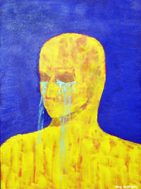
I can’t recall when I painted “Tears”. I chose a large canvas about 30″ x 36″ or something similar. I probably laid down a coat of black Gesso first (I like a black undercoat), though I may have left the canvas white. I wanted to bring out the color like Van Gogh did, so I used medium to high tones of contrasting colors. I used a blue background to bring out depth, because blue is usually associated with distance. I believe I kept that texture smooth (I don’t know where the painting is now, maybe still in Corpus Christi), so that no details would be outstanding and would bring out the depth more0. I used a yellow to contrast with the blue and because yellow is normally associated with being closer. I textured the figure with a palette knife to contrast with the smoothness of the blue and to bring the figure closer by adding detail. Overall, I wanted to keep details to a minimum in order to accent the man idea of a man crying copiously. I made the tears by stringing light blue house paint from a distance of a few inches (the closer one strings paint, the more control one has over it). I wished later that I had made the tears the same color as the background, because the ones over his chest disappear into the yellow, being of a similar tone. I am not good at drawing or sketching yet, so that’s another reason I tried to keep the details to a minimum. All in all though, I wanted to make an emotional connection to the viewer by simply showing a man shedding copious tears.
This is one of my earliest works where I was learning to develop a color strategy. I kept the texture rough by using palette knives. I made the yellow lines by dribbling paint from a sample of indoor house paint I obtained at a local paint store. I like dribbling paint, because it adds an element of randomness. I attempt to stir the emotions and intellect by using a combination of irregular (usually) shapes and colors. All my painting is very subjective. I decide what colors and shapes to use based on how they make me “feel” for lack of a better term. For example, some shapes give me the impression of being more or less violent while others may seem more or less peaceful. The same is true of colors. Some seem more peaceful or sedate than others. I choose the name of the work on a similar basis or sometimes at random–like a Rorshach test–I just use the first word that pops into my mind as the title. Often I use musical terms like symphony or concerto in the title, because those works are also a combination of subjective artistic elements flowing together to create a whole.