Tag Archives: design

Suspicion

Suspicion
Suspicion

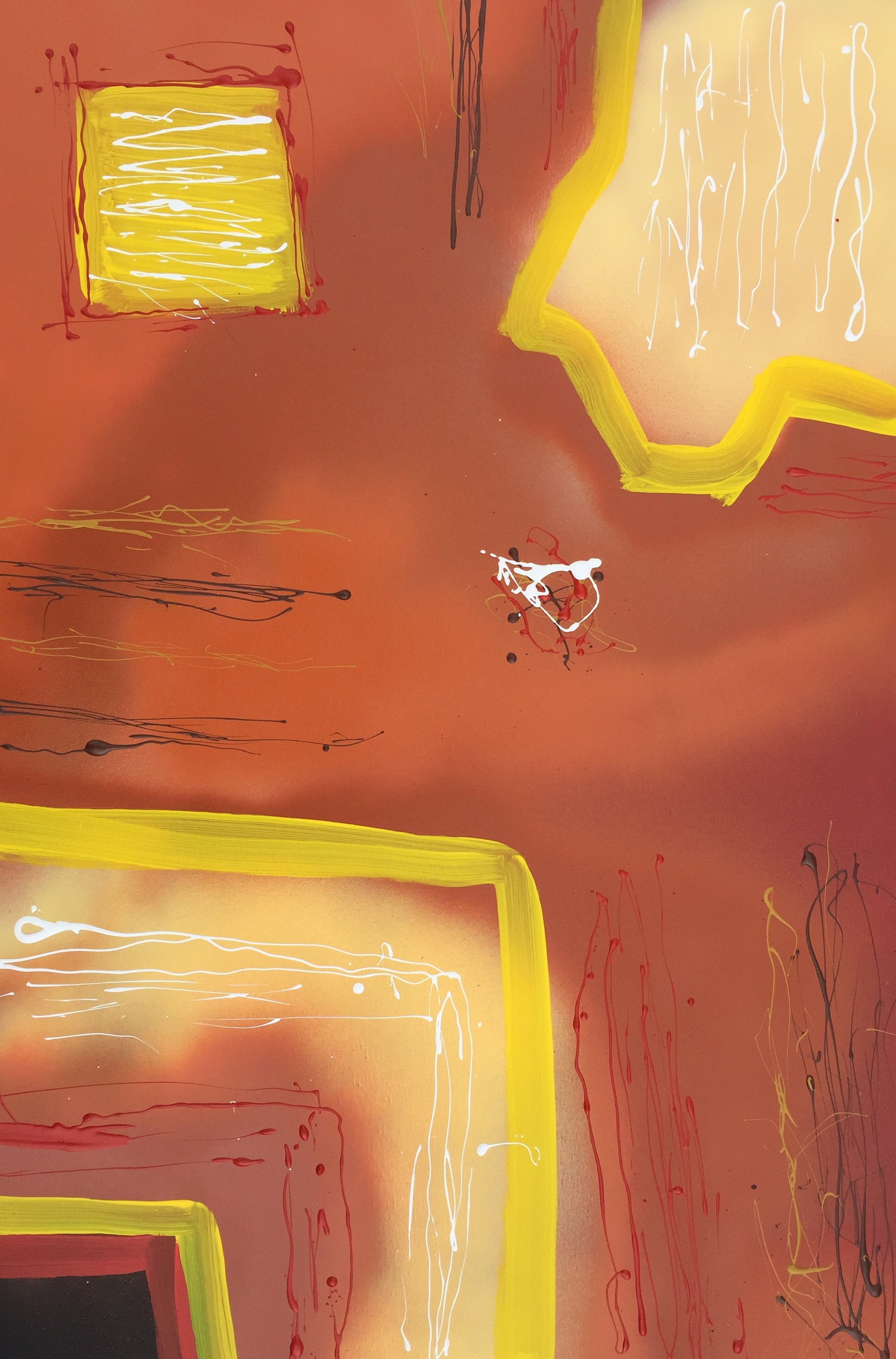
Suspicion is spray paint and latex on canvas, 36″ x 24″.  I created it on May 22, 2015.  I wanted to depart a little from my usual Jackson-Pollockish abstract expressionist  method of splattering paint onto canvas and try something more in the line of hard-edge painting. This turned out to be somewhere between the two.

I chose the name Suspicion, because if I were to put myself in the place of the white squiggle to the right of center, I would see hard edges all around on a vague, nebulous background with unidentifiable things moving toward me from all directions while being unaware of their purpose(s).   I have no idea what the technical, psychological name for this type of empathy/sympathy for a splatter of paint would be,  but now that I bring it up, a graduate student in psychology somewhere will probably write a paper about it.  I had no idea what I would name it when I was working on it.  I was just experimenting with form and color.

Dancing through Hell

Dancing through Hell by Phil Slattery
Dancing through Hell
by Phil Slattery

Another work created by using a photograph of a Danse Macabre from a Renaissance Faire and Photoshop Elements 2.0.  I tinkered with the photo until what you see here emerged.  I named it for the first impression that popped into my mind.

Wave and Sun

Wave and Sun
Wave and Sun

This has always been one of my favorites, though I am not certain why.  I painted this several years back (2009? 2010?) when I lived on the Gulf Coast at Corpus Christi, TX.  I do not recall how I came up with the idea.  Somehow it comes to mind that I was at Bob Hall Pier on North Padre Island when it occurred to me to have a wave with its crest pointing to the sun.  The sea and sky of course would be blue and the sun as a large yellow dot would draw the viewer’s attention to it along with the crest of the wave.   The sun would have to be off-center of course.  I made the texture of the wave by stringing light blue paint up and down in curves to shape the wave.  Now that I am thinking of it, it seems that a lot of the challenge in composition to me has been to draw the viewer’s eye around the canvas.  In my abstracts I try to do this by putting small spots of dabs of color against contrasting backgrounds.  For example, if I had a mostly dark blue abstract, I might put a dab of bright yellow paint in one corner and a bit of bright orange in another, and so forth, if I thought the viewer’s eye needed to go to that spot to keep the eye moving.   Anyway, that should be the subject for another post dealing with abstracts instead of something more realistic like this wave and sun.

Thoughts?  Comments?

Foxfire

Foxfire
Foxfire

This is a small digital work I created one evening while toying with Photoshop.  I used dark blue and black background to emphasize distance.  Then I risked straining the eyes of the viewer by using red balls, whose edges I darkened gradually to increase the three-dimensional effect.  It’s a simple work, but one I find intriguing even though I created it.

Tears

Tears
Tears

I can’t recall when I painted “Tears”.   I chose a large canvas about 30″ x 36″ or something similar.  I probably laid down a coat of black Gesso first (I like a black undercoat), though I may have left the canvas white.  I wanted to bring out the color like Van Gogh did, so I used medium to high tones of contrasting colors.  I used a blue background to bring out depth, because blue is usually associated with distance.  I believe I kept that texture smooth (I don’t know where the painting is now, maybe still in Corpus Christi), so that no details would be outstanding and would bring out the depth more0.  I used a yellow to contrast with the blue and because yellow is normally associated with being closer.  I textured the figure with a palette knife to contrast with the smoothness of the blue and to bring the figure closer by adding detail.   Overall, I wanted to keep details to a minimum in order to accent the man idea of a man crying copiously.   I made the tears by stringing light blue house paint from a distance of a few inches (the closer one strings paint, the more control one has over it).  I wished later that I had made the tears the same color as the background, because the ones over his chest disappear into the yellow, being of a similar tone.  I am not good at drawing or sketching yet, so that’s another reason I tried to keep the details to a minimum.   All in all though, I wanted to make an emotional connection to the viewer by simply showing a man shedding copious tears.

Thoughts?  Comments?