Tag Archives: composition

Hellstorm

Hellstorm
Hellstorm

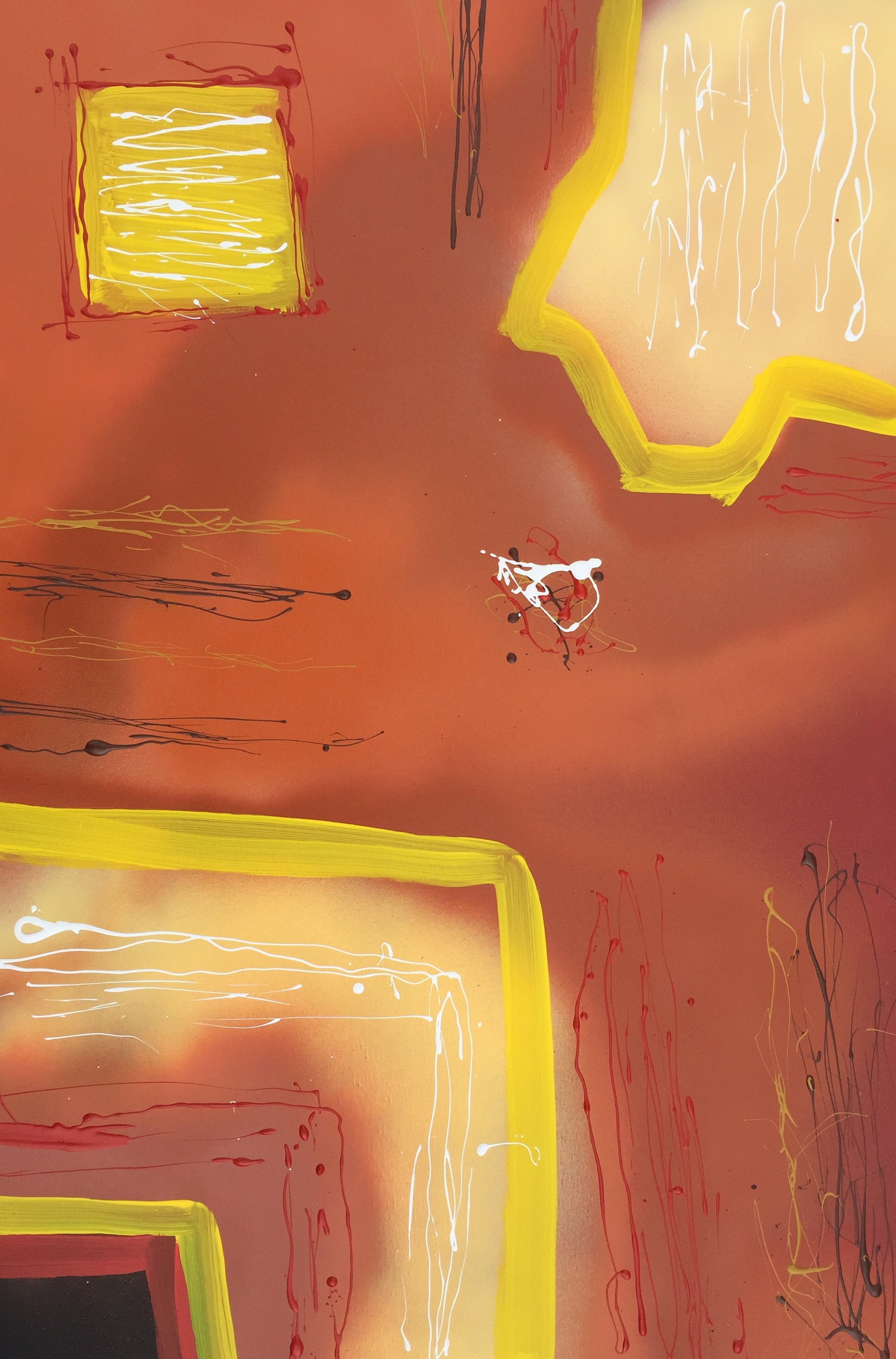
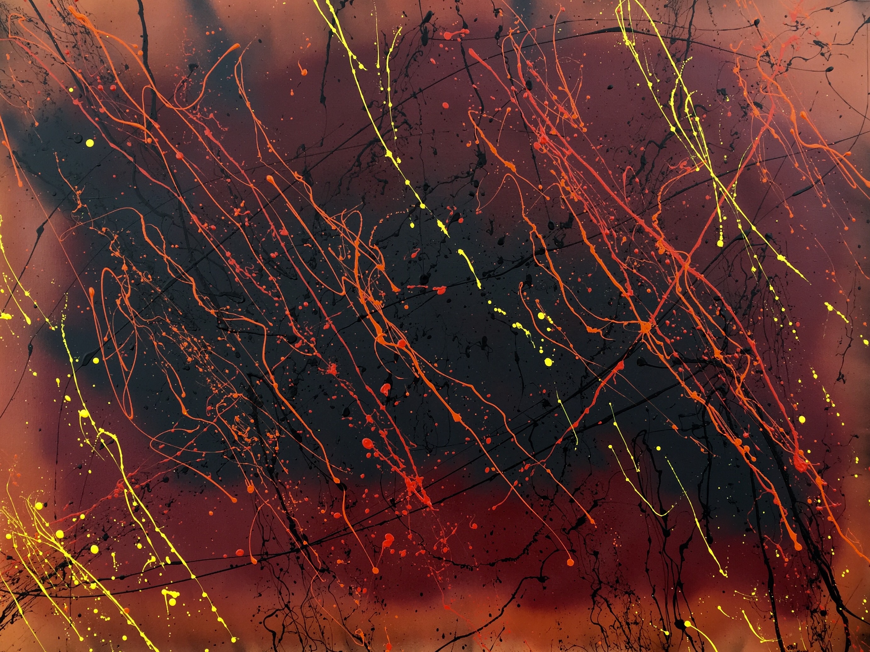
36″ x 48″.  Latex and spray paint.  Created June 6, 2015.

I was caught up by the same spirit when I was creating “De Profundis” and “Descent”.   As with them, I wanted something to capture a bit of the spirit of my upcoming (maybe in a few years) horror novel concerning hell.  I did not want to go to town to buy another canvas, therefore I re-used one on which I had a draft of another work, which was progressing more slowly than anticipated (I was using a brush rather than my usual abstract technique).  I used almost all my leftover spray paint in this.  As I progressed, I decided to apply the red, orange, and yellow so as to simulate depth by laying down the dark red in a few lines first, then the medium orange on either side of the red streaks, and then applying the yellow judiciously between the orange streaks.  The intent is that the dark red will tend to be seen by most people as farther in the distance, the orange closer, and the yellow closest of all.   The nebulous background created by the spray paint will likewise appear farther in the distance than the sharp, erratic lines created by stringing paint onto the canvas.   I have some to love this strategy of creating a nebulous background and then slinging house paint onto the canvas, which creates solid, sharp lines providing visual (and psychological?) contrast.

I struggled for a while with the name, eventually deciding on “Hellstorm”, because, for me at least, the painting alludes to a rain of magma in hell.

Suspicion

Suspicion
Suspicion

Suspicion is spray paint and latex on canvas, 36″ x 24″.  I created it on May 22, 2015.  I wanted to depart a little from my usual Jackson-Pollockish abstract expressionist  method of splattering paint onto canvas and try something more in the line of hard-edge painting. This turned out to be somewhere between the two.

I chose the name Suspicion, because if I were to put myself in the place of the white squiggle to the right of center, I would see hard edges all around on a vague, nebulous background with unidentifiable things moving toward me from all directions while being unaware of their purpose(s).   I have no idea what the technical, psychological name for this type of empathy/sympathy for a splatter of paint would be,  but now that I bring it up, a graduate student in psychology somewhere will probably write a paper about it.  I had no idea what I would name it when I was working on it.  I was just experimenting with form and color.

Anasazi Autumn

image This is another work from May 17-18. I wanted to toy with shades of brown, house paint, and spray paint. I sprayed the entire canvas with a sort of light tan/umber and then sprayed the edges with shades of brown.  My goal with the house paint was to bring out as much contrast as possible.  I tried something different in its application;  I dipped an artist’s paint brush in the desired color and strung/dribbled it across the canvas, producing thin threads, or flicked it sharply to produce sharp, violent splatters such as the yellow ones in each of the lower corners.   It is 24″ x 36″.

I struggled for a name and came up with “Anasazi Autumn” only tonight.  I chose autumn because of the autumnal colors and Anasazi, because I created it in Aztec, which is in what was the heart of the Anasazi region about 800 years ago.

Green Flash

Green Flash, circa 2010

I created “Green Flash” about 2010 for a show at the Corpus Christi Art Center.  A “green flash” is what occurs just as the last bit of the sun sinks below the horizon.  Because of various optic principles involving color, the bending of light, and the make-up of the Earth’s atmosphere, flash of green light occurs frequently (if not always) as last bit of the sun disappears from view.  I chose to represent this phenomenon with a minimum of representation.  I was living in south Texas at the time, which is very flat, so I chose to portray this as it might appear along the south Texas horizon.  Red, of course, is frequently the dominant color of sunsets, so both the sky and Earth are red, though in different shades and, also of course, it is great for bringing out green.  The green is the last bit of the sun and the short, black lines represent the south Texas scrub, which is mostly mesquite.    The paint is acrylic and the canvas size is 30″ x 40″.

Distance

Distance by Phil Slattery
Distance
by Phil Slattery


This came from a photo of a mannequin in San Diego I took about 1995 with a 35mm camera.  At the time I wanted to catch a mood of distance between people, not necessarily lovers, but between people who had some connection be it relatives, lovers, friends whatever. Some years later after I bought Photoshop Elements 2.0, it was one of the first photos I toyed with when exploring Photoshop.  I wanted still to capture that feeling of distance and toyed with several features until I produced this. The various subtleties of gray and white and the odd browns and greens add to the feeling along with the mottled look (like a very grainy photo) and, of course, the vacant, hollow eyes and the neutral feeling from the lips combine to make this a quite poignant work.