I created this circa 2009-2011, when I was living in Corpus Christi, Texas. It is latex and spray paint, 36″ x 24″. I tried to give the sun some texture by dribbling paint onto it, but I did it miserably and ruined the painting in my mind. I write it off as a lesson learned. Though it is hard to tell in this photo, the upper right corner has been damaged in storage. It is an interesting work, nonetheless. I was experimenting with complementary colors and a sort of impasto technique for the waves. The thin gray line in the lower right is not part of the painting, but a screw-up in my photography, which I shall correct when I have time. Now I must paint.
Another created during May 22-13, 2015. This is latex on Rustoleum’s Lagoon (satin finish), 36″ x 24″.
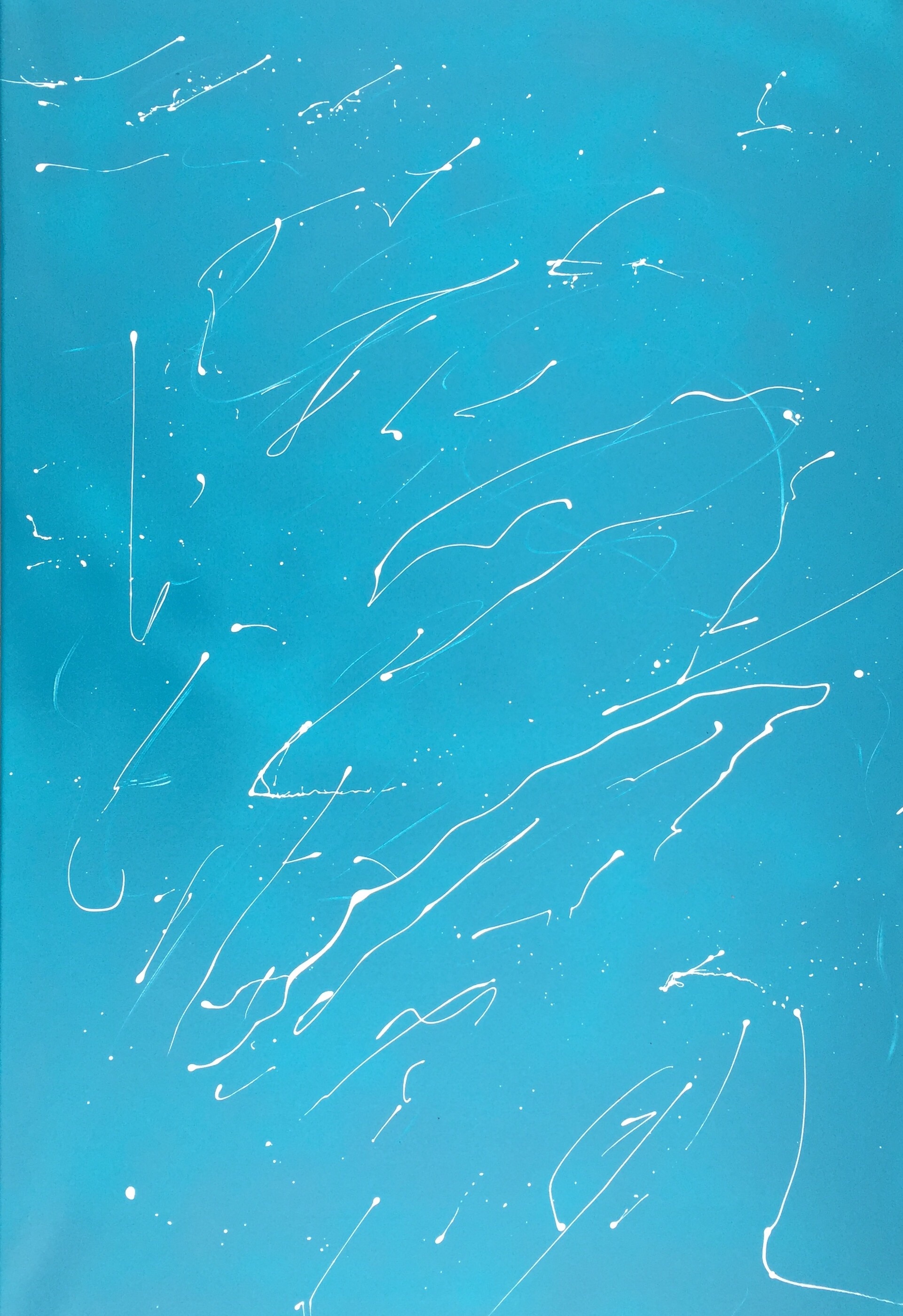
Once I had sprayed the background and while it was still wet, I decided to tinker with a subtractive process and scratched some random lines into the paint with a stick (I have been painting in my front yard of late–weather permitting) revealing the white canvas beneath. Then I carefully dipped a brush in white latex to maintain control over the paint and dribbled white lines approximately parallel to the scratches. The result gave the feeling of distance between the white paint and the faded white near it. This looks like a light snow falling from a clear, blue sky and thus the name.
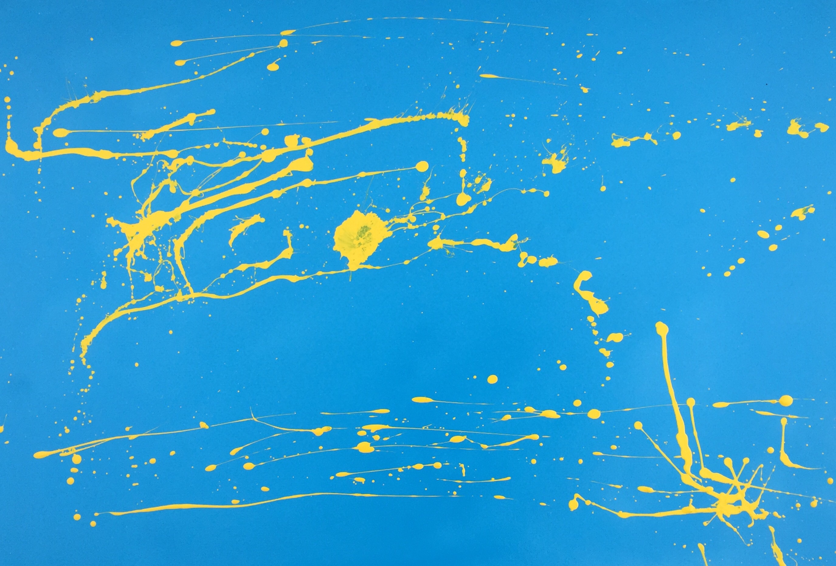
I created this on May 22-23, 2015 using Rustoleum’s Oasis Blue (satin finish) for the background and yellow latex that I had mixed at a local paint store. The canvas is 24″ x 36″. After I had sprayed the background, I felt I wanted to use just one color for the splatter (action might be a better word). I had used white already for A Winter’s Day and thought this tone of yellow would be a nice touch. I wanted to produce a bright but simple work that would grab the attention from across a gallery filled with competitors’ works. Part of my merchandising strategy is to produce works that are simple in concept and execution so that they stand out and are easily comprehensible from across a crowded gallery lined with other artists’ works of many colors, but which blend together in the eye from a distance, producing a muddled result. This optical strategy I derived from the little reading I have done on Georges Seurat and pointillism.
I used a bit of a convoluted means to arrive at the name. To me, the work looks like what one might see of the sun at the moment one were starting to spiral down to earth out of a clear, blue sky. This reminded me of the Greek myth of Phaethon, Apollo’s son, who asked to drive his father’s chariot, but found he could not control it and consequently crashed into the sea.
After contemplating this story for a moment, I thought Phaethon had to be mad to think he could take his father’s reins and that somewhere underneath this story has to be a psychological, Oedipal, Freudian foundation concerning the use of power and ego and the misjudging of one’s own capabilities. If there is a name for that, I don’t know it, so I will call it The Madness of Phaethon.
The depth of the symbolism behind the title surprised even me.
Suspicion is spray paint and latex on canvas, 36″ x 24″. I created it on May 22, 2015. I wanted to depart a little from my usual Jackson-Pollockish abstract expressionist method of splattering paint onto canvas and try something more in the line of hard-edge painting. This turned out to be somewhere between the two.
I chose the name Suspicion, because if I were to put myself in the place of the white squiggle to the right of center, I would see hard edges all around on a vague, nebulous background with unidentifiable things moving toward me from all directions while being unaware of their purpose(s). I have no idea what the technical, psychological name for this type of empathy/sympathy for a splatter of paint would be, but now that I bring it up, a graduate student in psychology somewhere will probably write a paper about it. I had no idea what I would name it when I was working on it. I was just experimenting with form and color.
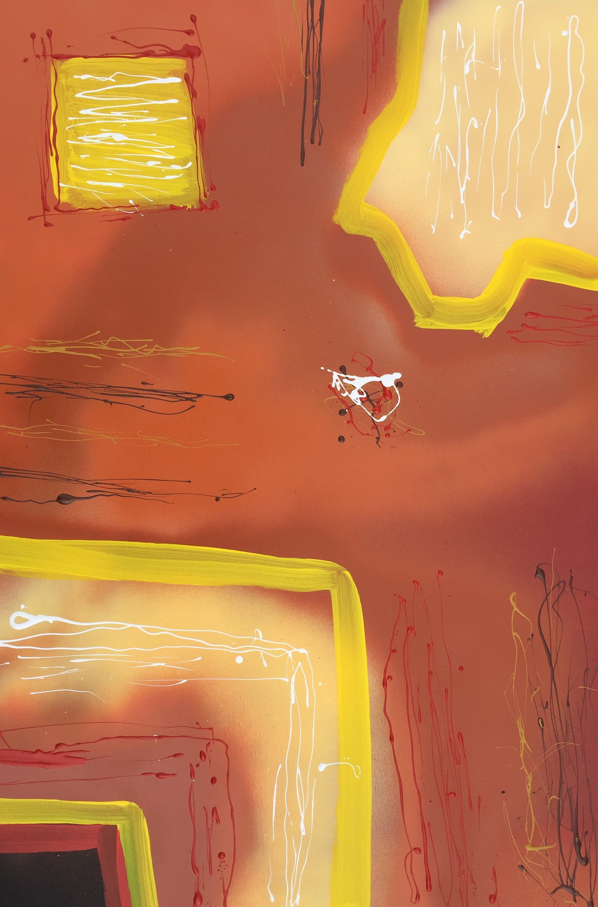
This is the last of the May 17-18 works. This one is 16″ x 20″. This was another experiment with colors and techniques that intrigued me at the moment. Originally, I chose the title “The Honey Sonata”, because the background color resembles honey and sonata because, like with some of my previous paintings, I see a rhythm or “musicality” in some of my works. However, after some contemplation, I changed it to the present title. The primary reason for the change was simply because “The Honey Sonata” just didn’t sit well with me subjectively. The other reason is because a sonata is primarily for a keyboard instrument and there is no obvious connection to a keyboard instrument in this work. Concerto in Yellow Minor seemed to be a better fit, because a concerto is usually for one instrument (the dominant color equivalent here is yellow), but it can generally be any instrument. I chose “…Yellow Minor” simply because it is a lighter, weaker shade of yellow. A stronger, darker yellow I would call “yellow major”