Publisher, Rural Fiction Magazine; publisher, The Chamber Magazine; founder, the Farmington Writers Circle. I have written short stories and poetry for many years. In my careers as a Naval officer and in the federal government, I have written thousands of documents of many types. I am currently working on a second edition for my poetry collection and a few novels.
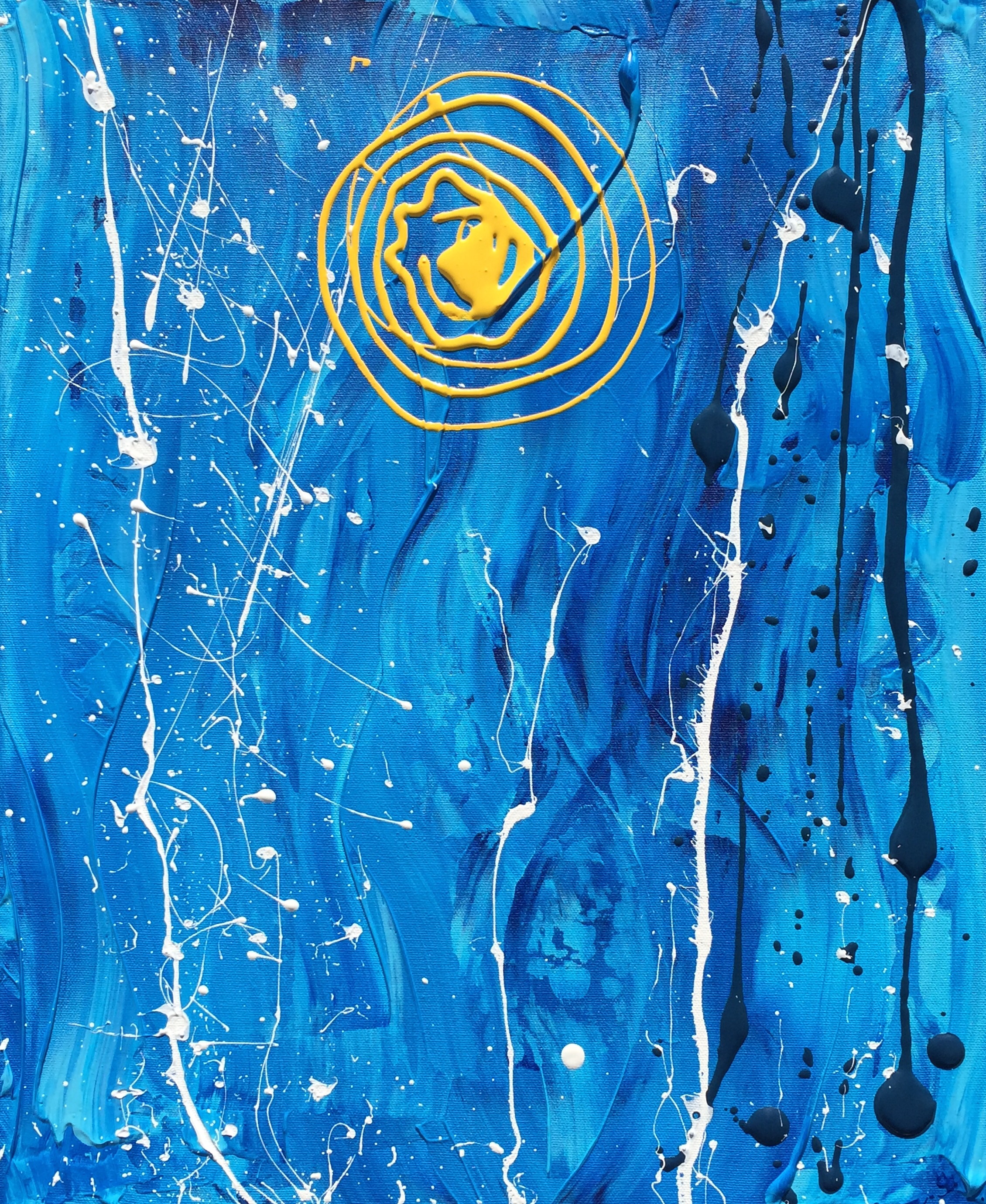
Here is another I created on May 18, 2015. I wanted to give the impression of a bright, dominating sun on a clear winter’s day when the cold has that snap to it. I used the colors associated with such a day. The paints are acrylic and latex and the canvas is 16″ x 20″. I will be showing this in Farmington during June.
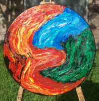
Although I did not create this work today, I thought I would post about it as it is the first work I created using a tabletop. This work has the distinction of being my only work shown in the South Texas Museum of Art as part of a temporary exhibit by the South Texas Art League. I made it somewhere in the 2007-2011 timeframe. I applied earth colors heavily and smeared them using putty knives or palette knives. I then dribbled latex paint from Pittsburgh Paints onto those colors and coated it all with a heavy pottery glaze for added effect. I entitled it “World on Fire” to represent the environment going up in flames because of bad practices such as deforestation of the rainforest, warfare, and other catastrophes. As with “Blue Jupiter” and “Pluto Ascending” I attached black wooden slats to the back of the work to push it away from the wall and to provide space for the hanging wire. It is 24 inches across, about two inches thick, and quite heavy being of solid wood (oak, I believe).
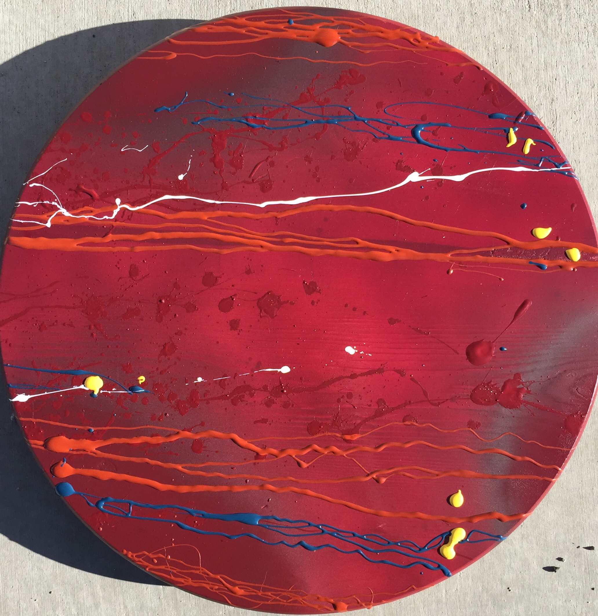
This is the second work I created today using a tabletop from Lowe’s. I chose Pluto because of today’s headlines concerning the New Horizons spacecraft coming into view of all of Pluto’s five moons. In July, New Horizons will be at its closest point of approach to Pluto. Therefore, as of today, the New Horizons flight will probably be discovering new facets of Pluto with great frequency, thus the name “Pluto Ascending”, because when something ascends, it comes into view.
I read in an article today that Pluto has a reddish tint. The best photos I have seen of it so far in Google Images have been fuzzy. Therefore I made Pluto overall dark red with some areas black and nebulous to symbolize the unknown. I made a few points white or yellow to symbolize new discoveries coming to light. I used blue and orange-red to provide some additional colors and contrast. Paints used were acrylic and latex. The tabletop is 18″ across. As with “Blue Jupiter” I attached two black wooden slats about one inch thick to push the tabletop away from the wall and to provide space to attach the hanging wire. This also has the benefit of making the work seem to float in the air an inch away from the wall.
In preparing for the upcoming show I found two small tabletops lying around that I had purchased months ago from Lowe’s for experiments with something other than traditional canvas. For me, the most obvious thing they could represent would be planets, particularly with NASA’s latest exploratory expeditions being so prominent in recent headlines. After contemplating what could be done with the smallest tabletop, I thought that the wood grain could represent the bands around Jupiter. There is also a small defect in the wood in almost the same location as the Jupiter’s famed red spot. Therefore I decided to mask the defect with red latex. I used a yardstick to approximate Jupiter’s band and it worked fairly well. To bring out the red spot, I made the rest of the planet various tones of blue. I used white and shades of brown to enliven the work “Blue Jupiter” is fifteen inches in diameter. .
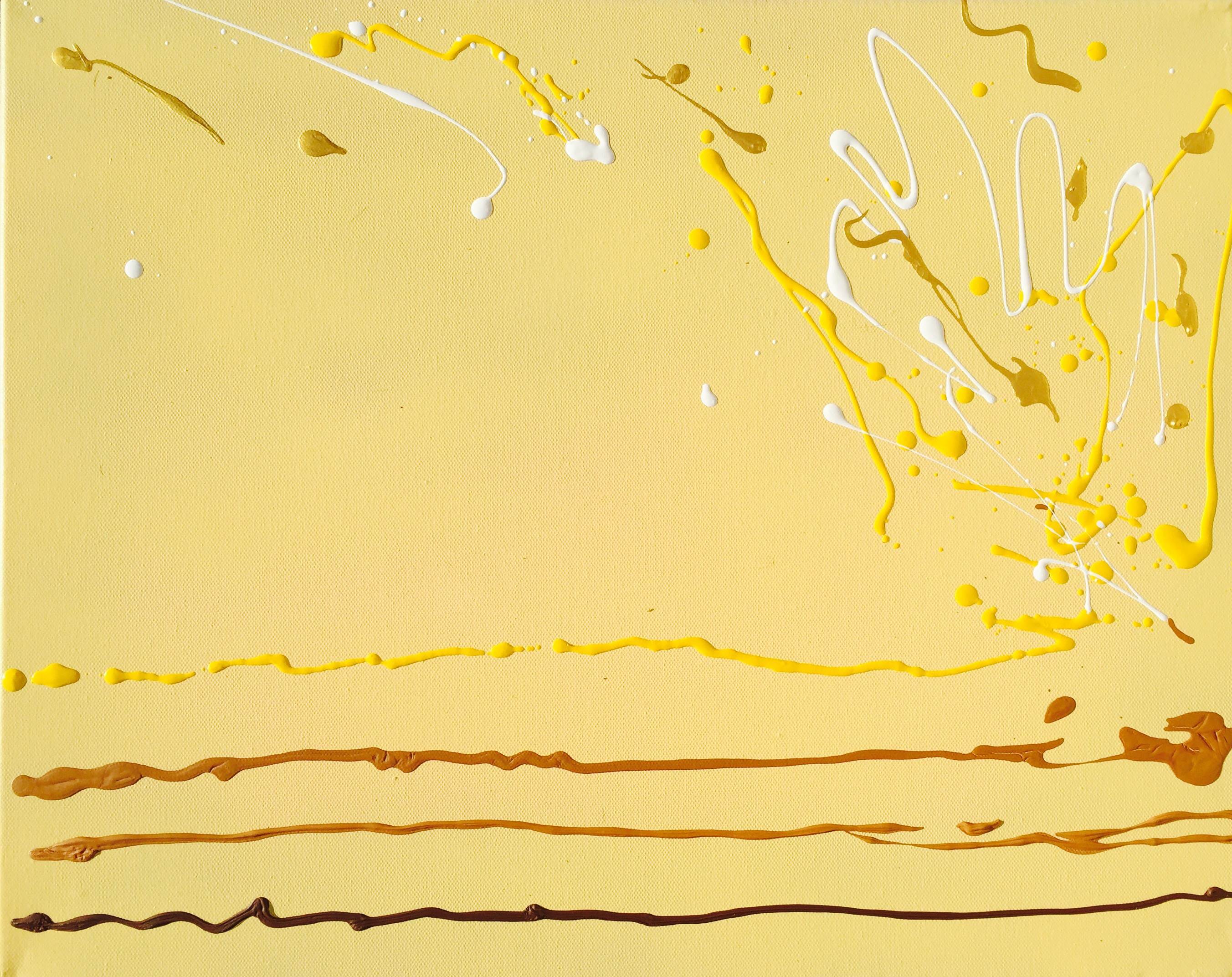
This work is 16″ x 20″ and made with acrylic and latex. I wanted to experiment with yellow and shades of brown. The name represents the sound and not soda or someone’s dad. I put three lines at the bottom of the work running, theoretically, from left to the right, where the top line explodes. The “explosion, stretches back to the left to attract the viewer’s eye to the top left corner, in order to keep the eye moving around the canvas. “Pop” was the first painting I made for this show.