Publisher, Rural Fiction Magazine; publisher, The Chamber Magazine; founder, the Farmington Writers Circle. I have written short stories and poetry for many years. In my careers as a Naval officer and in the federal government, I have written thousands of documents of many types. I am currently working on a second edition for my poetry collection and a few novels.
By Lekha Murali Where human bonds run so deep, To have withstood the test of attrition – time and time again; That discord and harmony could co-exist peacefully, When substantive conversations dissolve pretense and insecurity, That neither has the need to coddle the other emotionally Where one is at ease with the other as with […]
Yesterday, I challenged myself to create another woodland scene — and to do it in a small-scale format. It was the first time I’ve tried painting on a 5 x 7 inch panel, and it was a challenge, indeed.
A summary of a classic Yeats poem The poetry of Yeats often touches upon the idea of chucking it all away and heading off somewhere. In ‘Sailing to Byzantium’, one of his most popular poems, the ageing poet takes himself off to the Turkish city in search of spiritual fulfilment and retraining. But one of […]
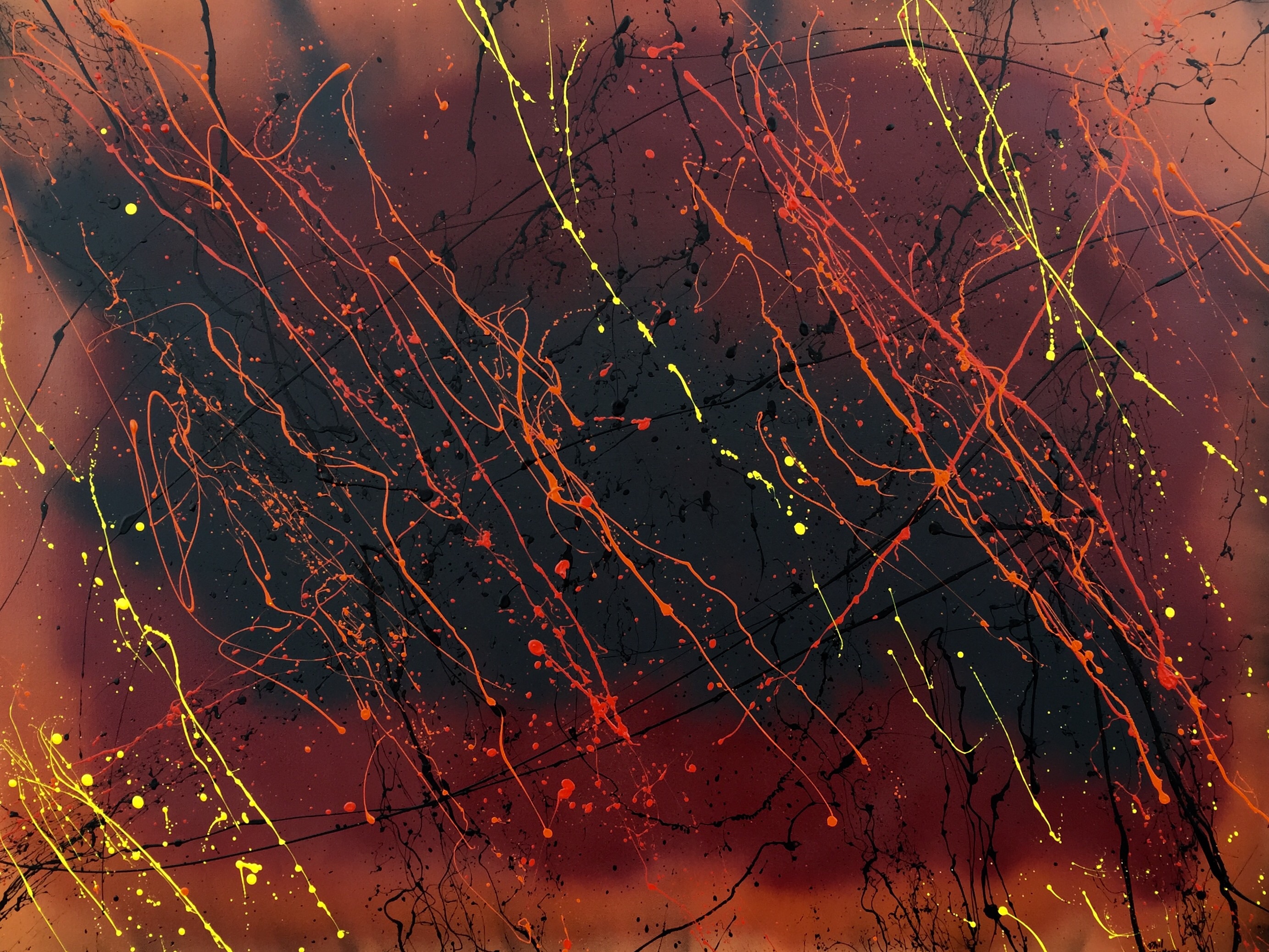
36″ x 48″. Latex and spray paint. Created June 6, 2015.
I was caught up by the same spirit when I was creating “De Profundis” and “Descent”. As with them, I wanted something to capture a bit of the spirit of my upcoming (maybe in a few years) horror novel concerning hell. I did not want to go to town to buy another canvas, therefore I re-used one on which I had a draft of another work, which was progressing more slowly than anticipated (I was using a brush rather than my usual abstract technique). I used almost all my leftover spray paint in this. As I progressed, I decided to apply the red, orange, and yellow so as to simulate depth by laying down the dark red in a few lines first, then the medium orange on either side of the red streaks, and then applying the yellow judiciously between the orange streaks. The intent is that the dark red will tend to be seen by most people as farther in the distance, the orange closer, and the yellow closest of all. The nebulous background created by the spray paint will likewise appear farther in the distance than the sharp, erratic lines created by stringing paint onto the canvas. I have some to love this strategy of creating a nebulous background and then slinging house paint onto the canvas, which creates solid, sharp lines providing visual (and psychological?) contrast.
I struggled for a while with the name, eventually deciding on “Hellstorm”, because, for me at least, the painting alludes to a rain of magma in hell.